Design Insights from 14+ Years in Inclusive UX Practice
This case study is a set of professional design recommendations informed by public observations. These are my personal evaluations based on years of experience as a UX and accessibility specialist across high-scale platforms.
For years, Airbnb has been held up as a gold standard in product design, hailed for its visual polish, clever branding, and frictionless user experience. But once you pop the hood and examine the structure, accessibility, and code behind it, you’ll find a different story. Beneath the veneer of aesthetic minimalism lies a surprising amount of inconsistency, exclusion, and negligence.
This case study takes a critical look at the Airbnb experience through the lens of accessibility, semantic structure, and design integrity. It’s not about attacking, it’s about raising the bar for truly inclusive, thoughtful design.
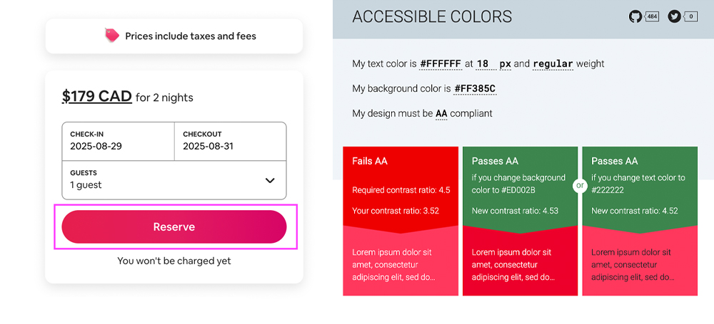
1. Failing AA Colour Contrast in Primary CTAs
Airbnb’s primary buttons fail to meet WCAG 2.1 AA contrast standards, making key actions harder to perceive for users with low vision or colour blindness. A modest darkening of the button colour would have been enough to meet compliance, a straightforward fix that was inexplicably missed.
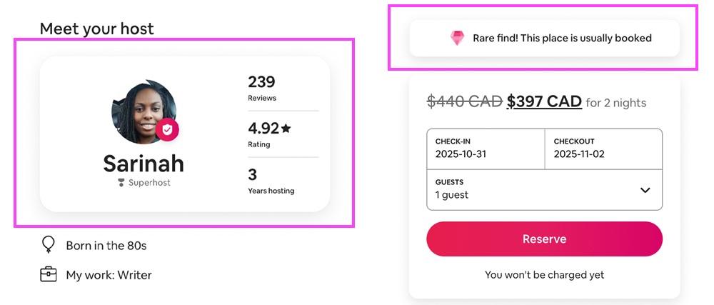
2. Inconsistent Visual Language for Interactive Elements
Consistency is critical for usability. In the example above, the left-hand side box is interactive, while on the right, two boxes share the same visual treatment, yet only the bottom one is clickable. The top box is static. While UX is often contextual, using identical styling for both interactive and non-interactive elements breaks user expectations and undermines clarity.
3. Low-Contrast Disabled Elements
Disabled buttons and inactive UI states lack sufficient contrast from the background, making them virtually invisible to users with impaired vision or even in lower-light settings. Poor visual differentiation here means users might not even realize functionality is unavailable.
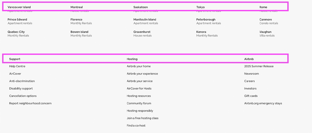
4. Footer Confusion: Links vs Static Text
Interactive links and static bold text share the same styling. Users can't tell what they can click on. In the image above, city names are clickable links, while categories like ‘Support’ are not, yet both are styled identically, creating confusion about what’s interactive and what isn’t.
5. Lack of Semantic HTML
A peek under the hood reveals that Airbnb often uses <span> and <div> tags in place of semantic elements like <button>, <main>, or <footer>. This isn’t just bad practice, it harms SEO, accessibility, and maintainability. Screen readers and assistive tech rely on semantic HTML to convey meaning and structure.
Need help shaping your UX story?
From product strategy to accessibility and execution, I help teams and individuals clarify their vision and elevate their work. If you're serious about improving your UX outcomes, let’s talk.
Book a Free Consultation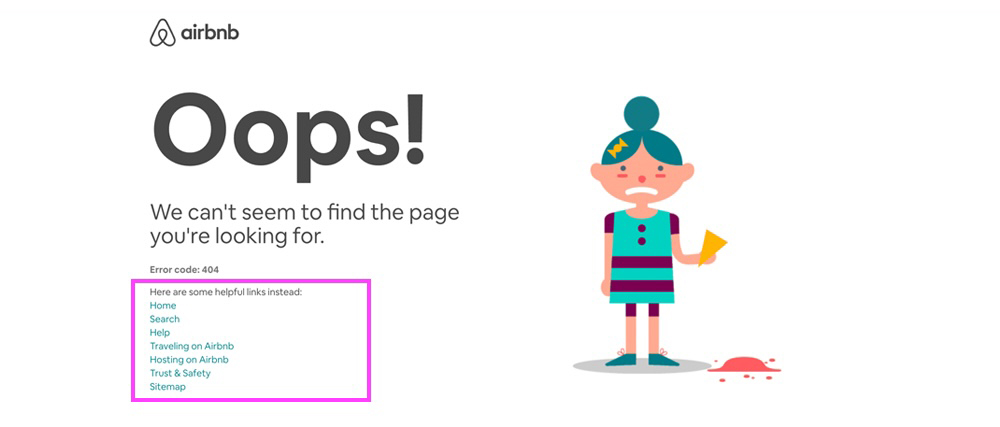
6. A 404 Page That Blames the User
Their 404 error page features an image of a person dropping an ice cream cone, paired with the word “Oops!” as if the user did something wrong. Error states should be empathetic and take responsibility. Shifting blame to the user damages trust and feels tone-deaf, especially when it’s the system that failed to deliver.
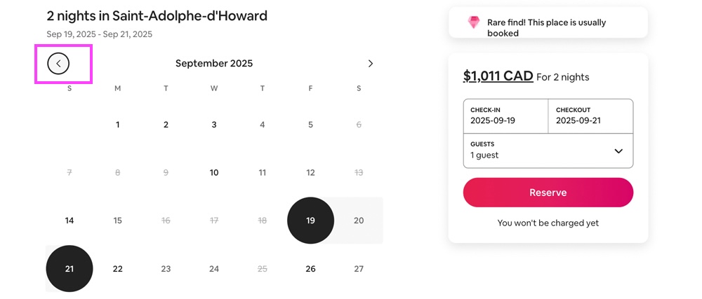
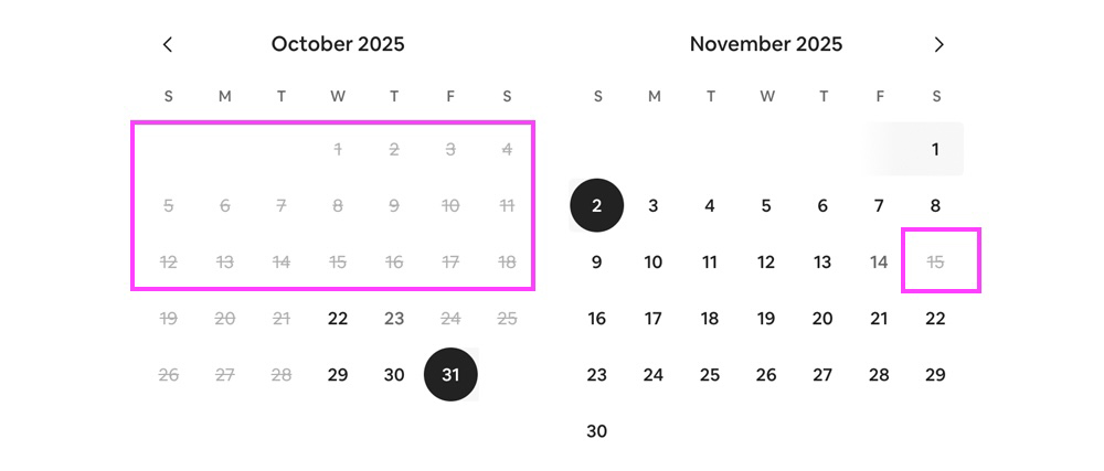
7. Broken Keyboard Navigation
Although keyboard navigation worked on desktop during my QA, it did not work on iPad with Magic Keyboard and Safari. According to Airbnb’s own Accessibility Statement, tablets are not part of their keyboard-access testing, and keyboard access in their native apps is explicitly excluded from QA coverage. That means core experiences, even on web, may be broken on tablets or app contexts. I wasn’t able to tab into the date picker, select a check‑in, or exit the calendar with only keyboard access.
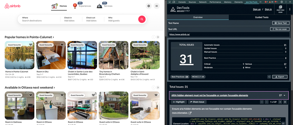
8. Automated Accessibility Audits Reveal Serious Gaps
I ran an accessibility audit using Google’s Axe Report tool, which identified 31 issues, with 27 labeled as serious. These weren’t niche technical problems. Most could have been addressed through basic design QA or built-in accessibility checks during the development process.
What’s striking is not just the volume of issues, but the fact that automated tests like this appear to have been skipped altogether. For a company at Airbnb’s scale and reputation, this represents a missed opportunity to lead by example in building inclusive, user-friendly products.
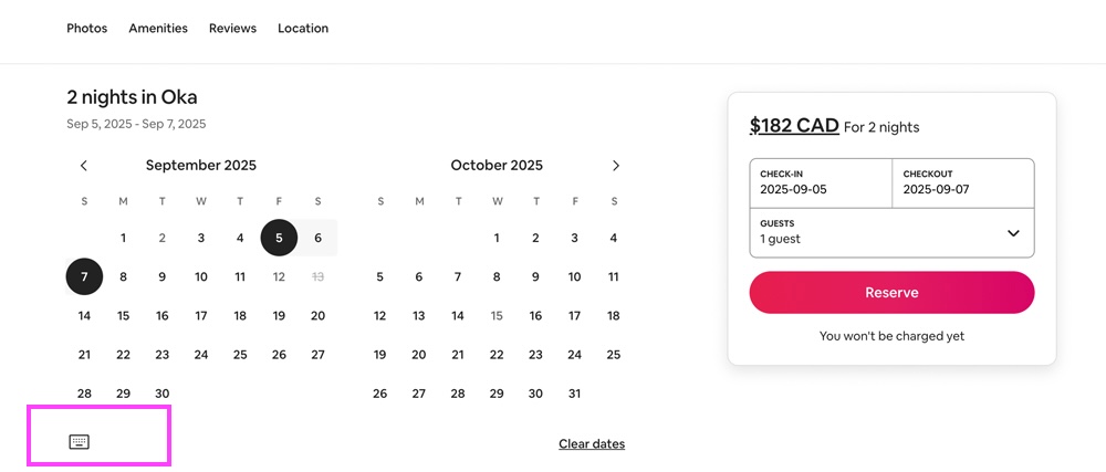
9. Icons Without Labels
Airbnb relies heavily on iconography, yet many icons have no visible labels. Take the keyboard shortcuts icon: it’s a simple keyboard glyph with no text or tooltip. Users are left to guess what it does. For accessibility and usability, icons should always be paired with text unless universally recognized.
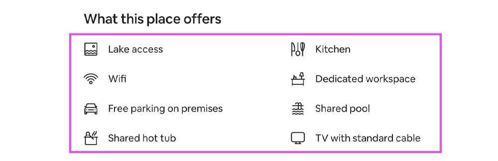
10. Inconsistent Use of Icons
Icons sometimes accompany text (implying interactivity) and sometimes appear alone (sometimes as links, sometimes not). This inconsistency breaks the expected relationship between icon and action, forcing users to experiment to learn the interface. It’s lazy design that prioritizes aesthetics over clarity.
Final Thoughts
Airbnb gets a lot right in terms of branding and layout. But design is more than that, it’s about giving every user a fair, usable, and accessible experience. These observations are offered not as criticism for its own sake, but as a push for higher industry standards. If leaders like Airbnb fall short on the basics, what signal does that send?