Accessible. Actionable. Scalable.
Over the years, I’ve worked across healthcare, banking, government, and entertainment, leading the design of Power BI dashboards in complex, high-volume environments. Because of confidentiality agreements, I can’t share details from those engagements. What I can share are distilled, field-tested recommendations for creating dashboards that balance stakeholder goals with real user needs.
These are lessons learned, not secrets spilled.
1. Font Size Is Not a Style Preference, It’s an Accessibility Standard
Too many Power BI dashboards use default font sizes under 16px. That’s a problem, especially for data-heavy views. Typography must support legibility, not hinder it. At a minimum, body text should be 16px and clearly scannable.
2. Don’t Overwhelm with Cognitive Load
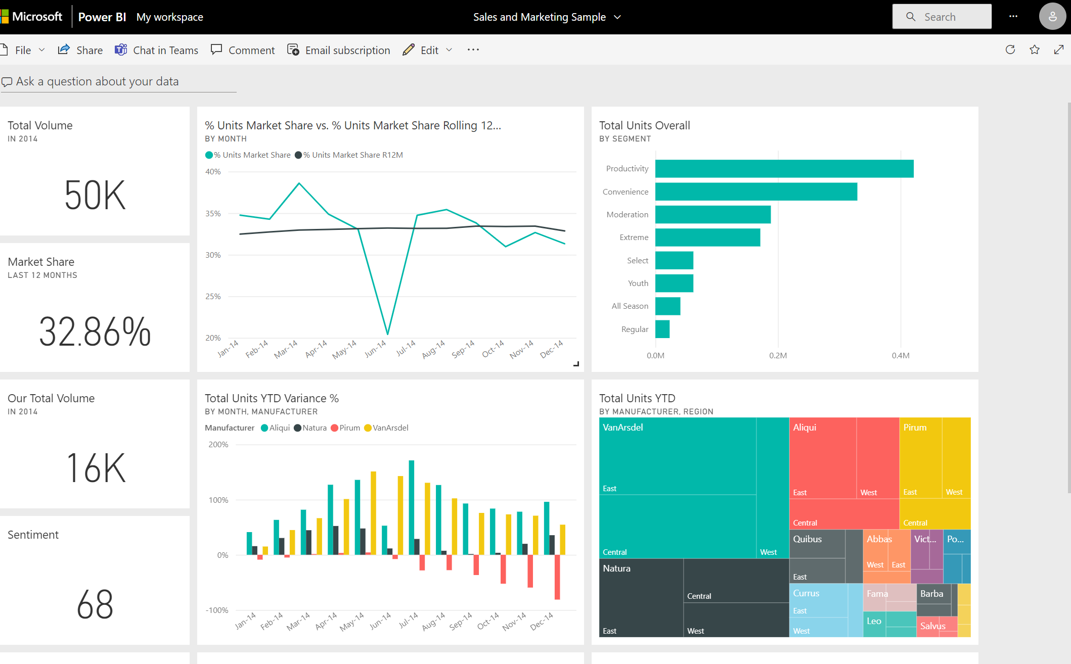
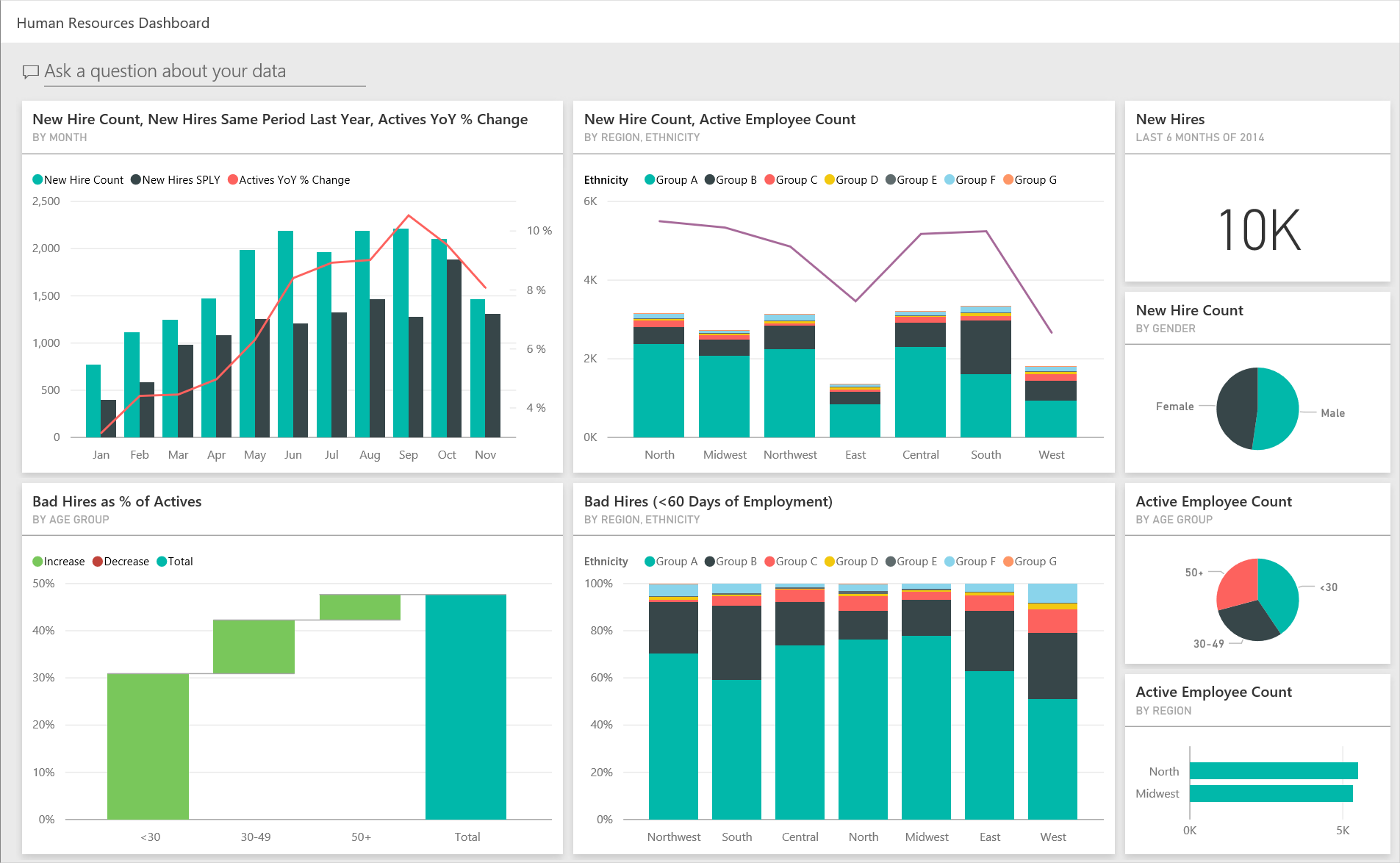
Dashboards with 10+ graphs, 20 filters, and zero guidance are more confusing than helpful. Break up content. Use progressive disclosure. Chunk related info together. Let users breathe.
3. Fix the Defaults: Slanted Text and Low Contrast
Power BI visuals often include slanted x-axis labels, which are harder to read and poor for accessibility. On top of that, default colour palettes often fail WCAG contrast guidelines. If the first thing users see is hard to read, you’ve already lost them.
4. Design for Keyboard-Only Users
A significant percentage of users rely on keyboard navigation. Ensure logical tab order, visible focus states, and interactive elements that don’t require a mouse. This isn’t just ethical, it’s legally required in many regions.
5. POUR Principles Should Guide Everything
- Perceivable: Content must be visible, readable, and logically presented.
- Operable: All functionality must work with a keyboard or assistive tech.
- Understandable: Use plain language, short labels, and clear instructions.
- Robust: Ensure compatibility with JAWS, NVDA, VoiceOver, and others.
6. Structure Navigation Like a Portfolio
- Portfolio view: A high-level overview.
- Summary view: Key metrics at a glance.
- Detail view: Where users can drill down into the numbers.
7. Use Breadcrumbs to Prevent Getting Lost
If the dashboard goes deeper than two levels, add breadcrumbs. Power BI doesn’t offer native breadcrumb components, but you can create them with custom visuals or HTML overlays. Without them, users get lost fast.
8. Native Power BI vs Hybrid HTML
Choosing between native Power BI and embedding it in an HTML wrapper comes down to trade-offs. Native is fast but limited. HTML gives you more control (headings, semantic structure, layout) but adds development overhead. Pick what your team can realistically maintain.
9. Optimize for Performance
Every data point has a load cost. Optimize KPIs, cache non-critical visuals, and delay heavy data queries until user interaction. Fast dashboards build trust, slow ones frustrate.
11. Tables vs Cards
Multi-column tables don’t translate to mobile. Use card views, chunked information, and toggles. Not everything needs to be on one screen, especially on a phone.
Need help shaping your UX story?
From product strategy to accessibility and execution, I help teams and individuals clarify their vision and elevate their work. If you're serious about improving your UX outcomes, let’s talk.
Book a Free Consultation12. Choose the Right Visual for the Story
Don’t just drop in donut charts because they look nice. Ask: What is the user trying to understand? Sometimes bar charts beat fancy visuals. Sometimes simple beats “cool.”
13. Always Test with Assistive Tech
Automated tools aren’t enough. Test your dashboards manually with screen readers like JAWS, NVDA, and VoiceOver. Make sure ARIA labels, alt text, and heading structures work in the real world.
14. Define Filters and Metrics Early
Don’t wait to decide what data matters. Work with data scientists and business leads from day one. Define the key metrics and what filters empower exploration, not overwhelm.
15. Use Real Assistive Tech in Testing
Don’t rely solely on Lighthouse or axe. Test your dashboards with JAWS, NVDA, VoiceOver, and Narrator. Manual testing reveals what automation can’t.
16. Involve Devs, QAs, and Data Scientists
- Developers: Confirm feasibility early.
- QAs: Test layout, function, and responsiveness.
- Data Scientists: Validate what’s being visualized and why.
17. Use Legends That Pass WCAG
Colour-coded data is useless if you can’t distinguish the colours. Legends must be visible, legible, and accompanied by text or icons, especially for users with colour vision deficiencies.
18. Create a Dashboard Lexicon
Dashboards often include domain-specific terms. Instead of overwhelming new users, include a dictionary or tooltip glossary. Never rely on hover-only definitions, they don’t work on mobile or for many assistive tech users.
19. Use Instructional Text at Key Points
A short sentence like “This shows revenue by channel. Use filters to narrow results.” can make a massive difference. Give users context before they start clicking.
20. Establish Proper Heading Hierarchy
Use H1–H6 structure (either natively or via HTML overlay) to give semantic structure to your dashboard. This helps screen readers, improves scanability, and creates a rhythm to your layout.
21. Make Every View Actionable
Dashboards are not newspapers. Users need to know: what should I do with this info? Add calls to action, download links, or even just text like “Share with your team if this trend looks off.”
22. Show When the Data Was Last Updated
A timestamp that says “Last updated: Aug 2, 2025” builds credibility. Combine that with a refresh button to give users control.
23. Avoid Horizontal Scroll
Horizontal scroll breaks layout predictability and causes issues for assistive tech. Power BI’s default behaviour sometimes adds it, override that whenever possible. Stick to vertical.
Final Thoughts
Power BI dashboards are more than data wrappers. They’re digital products that should be as accessible, inclusive, and action-oriented as anything else we design.
These recommendations weren’t downloaded from a blog post. They’re the result of years of trial, error, testing, and learning, and they’re here to make your dashboards actually work.