The views expressed here are solely my own and do not reflect those of my employer or any government agency. As a UX designer, I share my personal perspective on enhancing human experiences across industries.
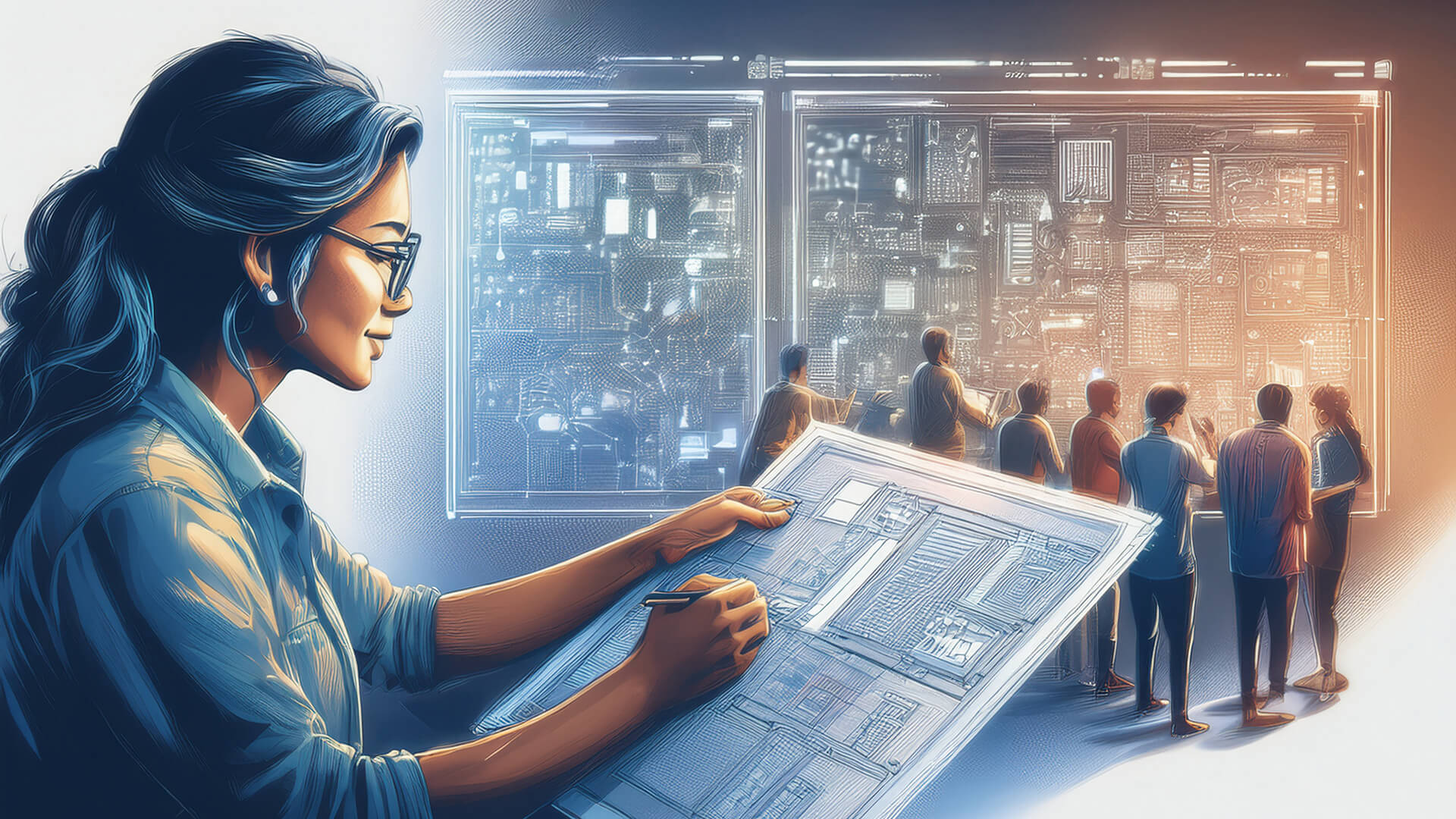
UX Is for Everything: Why Every Industry Needs Human-Centred Design
In tech, we iterate.
We launch, we listen, we improve.
If something frustrates users, we fix it.
That’s the heart of user-centred design: doing the hard work so the user doesn’t have to.
But outside of digital product teams, that mindset rarely exists.
Dentists. Hospitals. Transportation systems. Public restrooms.
Most industries haven’t rethought their core experiences in decades.
And users feel it.
This post is a call to every field, not just software.
If real people interact with it, it deserves design thinking.
Because UX isn’t about screens. It’s about empathy.
Ultrasound: Built for Doctors, Not Patients
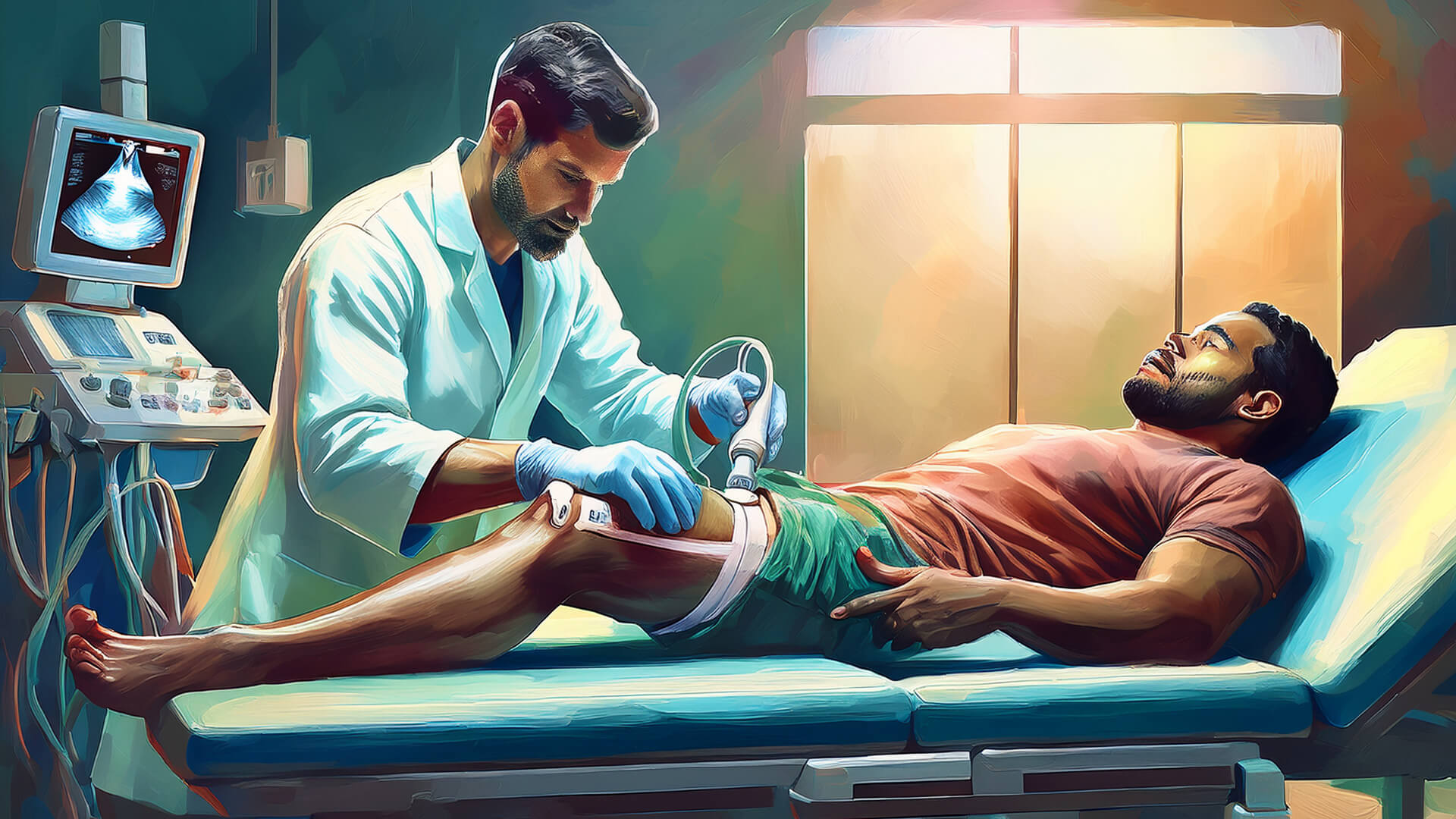
Ultrasound technology was introduced in the 1940s by Austrian neurologist Karl Dussik. Over 80 years later, the experience remains mostly unchanged.
- The gel is still freezing cold
- The wand is still pressed directly onto the pain point
- The user — the patient — is rarely considered
The device was designed for doctors, not patients.
A UX approach would:
- Warm the gel
- Reduce unnecessary discomfort
- Provide clear guidance and emotional support during the procedure
Good design doesn’t just work. It cares.
Dentistry: A Full-Sensory Failure

Dental drills date back to the 19th century. While tools have evolved, the experience hasn’t.
- Harsh, sterile smells
- Anxiety-inducing high-pitched sounds
- Discomfort from unnatural posture
- Painful procedures with little warning
- Paperwork handed to you while you’re visibly in pain
Designers are trained to consider all sensory touchpoints: sound, smell, taste, light, mood, and emotion.
The current dental experience fails at every level.
Design isn’t just about utility. It’s about dignity.
Emergency Rooms: No One Should Wait in the Dark
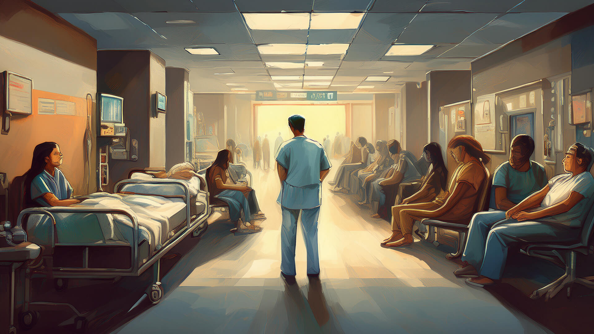
Emergency care systems were formalized in the 1960s. Most still treat patients like anonymous numbers.
- You check in with pain
- You sit in silence
- You have no idea how long the wait will be
Even a simple update like:
“You’re next. Doctor arriving in 12 minutes”
can radically reduce anxiety.
UX is not decoration. It’s transparency. It’s reassurance when people need it most.
Public Bathrooms: Designed Without Humanity
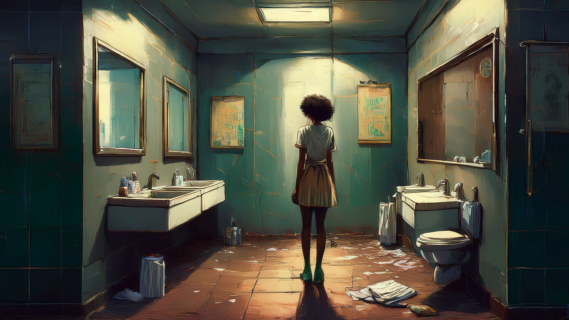
Public restrooms are some of the most neglected human experiences.
- Soap dispensers are empty
- Paper towels run out
- Floors are wet
- Urinals lack privacy
- No one knows when or how often they’re cleaned
Bathrooms are rarely cleaned based on usage data.
There is no feedback loop for maintenance.
Now imagine a smart bathroom:
- Sensors track supply levels and trigger alerts
- Foot traffic data triggers automated cleaning
- Full privacy panels in all stalls
- Touchless entry, faucets, and dryers
- A design that respects human dignity
We have smart homes. Why not smart restrooms?
Need help shaping your UX story?
From product strategy to accessibility and execution, I help teams and individuals clarify their vision and elevate their work. If you're serious about improving your UX outcomes, let’s talk.
Book a Free ConsultationDriving & Parking: Too Much Stress
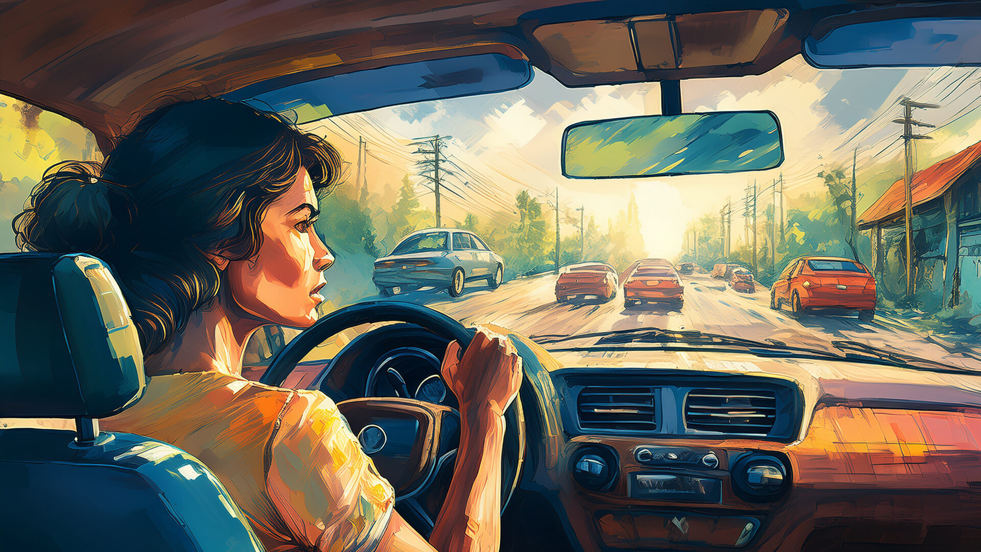
Parallel parking has existed since the 1920s. The experience hasn’t evolved much.
- Check multiple mirrors
- Strain your neck
- Judge angles
- Hope you don’t hit anything
Why doesn’t every car have an Auto Park button?
Tesla does. Some newer models do. But most cars are still UX disasters on wheels.
Bad UX increases stress. Good UX removes it.
Plastic Key Cards: Lost, Damaged, and Still Everywhere
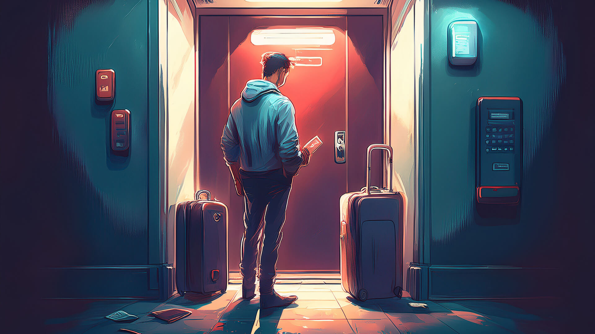
Hotel room keys. Office access cards. Apartment fobs. They’re fragile, outdated, and everywhere.
Lose one and you’re locked out.
Forget one and you’re stuck.
Why haven’t we moved on?
Modern options include:
- Smartphone-based digital keys
- Temporary QR codes for guests
- Biometrics for secure entry
Systems that anticipate failure and offer alternatives — that’s UX.
Just because something works doesn’t mean it works well.
Prescription Labels, Real Impact
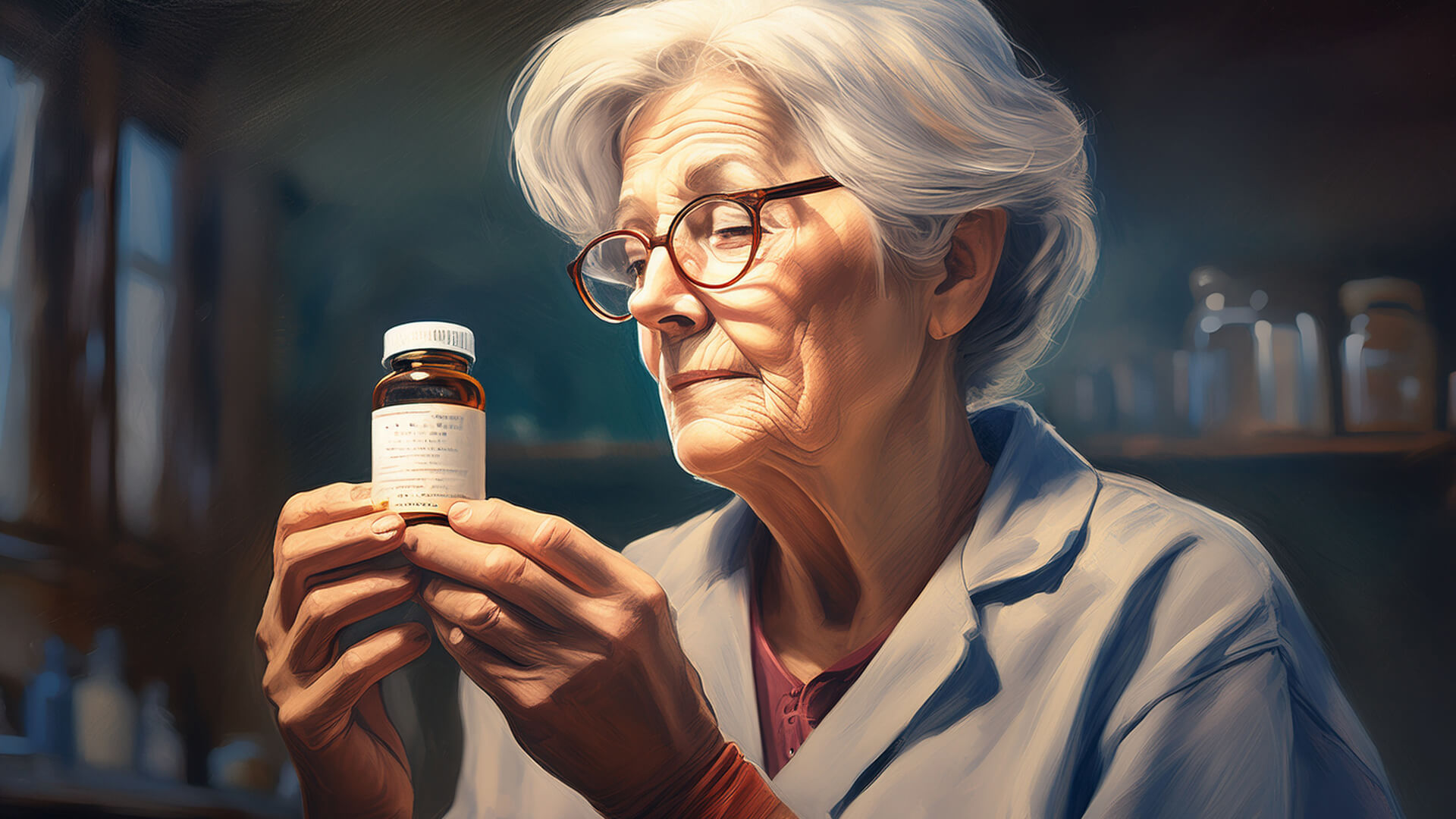
Most pharmacy labels are:
- Hard to read
- Poorly structured
- Confusing under stress
In 2004, Deborah Adler redesigned prescription labels after her grandmother took the wrong medication.
Her system introduced:
- Clear, bold patient names
- Large, readable text
- Colour-coded rings for families
- Visual hierarchy and icons
This wasn’t a branding exercise. It was life-saving design.
So why hasn’t it been adopted everywhere?
Why These Problems Persist
Most industries:
- Design for operators, not users
- Stop improving once something “works”
- Don’t observe real people using their product
- Don’t hire UX designers
- Don’t measure user pain
If your product causes stress, confusion, or fear, it’s not finished. It’s just been normalized.
What UX Designers Actually Do
We don’t decorate. We research. We empathize. We listen.
We:
- Interview real people
- Map their journeys
- Turn pain points into actionable insights
- Iterate based on feedback
- Improve over time
UX isn’t about visuals. It’s about comfort, clarity, and care.
If You Build Anything for People, UX Belongs There
You don’t need to be a tech company to hire a designer.
If your product touches a human being, it deserves thoughtful design.
Ask yourself:
- When was the last time you reimagined the experience?
- Are you solving user pain points, or just preserving the status quo?
- Are you designing with empathy, or for efficiency only?
If you want to improve people’s lives, start here.
Design shouldn’t stop when it works. It should continue until it feels right.